
My Role
Product Designer
User Research, Interaction, Visual design, Prototyping & Testing
Dec 2024
Overview
Yomaak is a B2B platform with the vision of becoming the leading B2B e-commerce platform in the Arab world.
The goal of this project was to identify usability issues within the dashboard Add product page during the beta release and determine the critical features to prioritize for the next iteration of the product. Additionally, we aimed to refine the post-subscription flow, as we received numerous complaints from subscribers who were unsure of the next steps after subscribing.
The Problem
"Yomaak's dashboard plays a crucial role in helping businesses list their products and services efficiently. However, users struggled with navigating the product entry process due to scattered information, an overwhelming category selection, and a lack of relevant filtering options. This led to frustration and inefficiencies, making it clear that the dashboard needed a more intuitive structure to improve usability and workflow."
🧭
Navigation Challenges
Users had trouble finding essential tools and features, slowing down their workflow and leading to frustration.
🤔
Bad Category Selection
The extensive list of categories made it difficult for users to find the right fit for their products or services.
📊
Bad Filtering System
The filtering options didn’t fully meet user needs, making it difficult to refine searches and manage listings efficiently.
Research & Discovery
User Complaints & Support Requests
Users frequently reached out through LinkedIn, WhatsApp, and email, reporting difficulties navigating the dashboard and confusion about the next steps after subscribing. The recurring nature of these complaints signaled a major usability issue.
Direct Interaction & Testing
While reviewing the platform’s user flows, I personally tested the dashboard and found that key actions weren’t as intuitive as they should be. Information was scattered, making it harder for users to complete tasks efficiently.
User Interviews & Direct Feedback
To get deeper insights, we conducted user interviews with 15 subscribers, reaching out through LinkedIn, WhatsApp, and email. We focused on their journey from subscribing to successfully listing their services or products. These interviews helped us pinpoint the key pain points users faced.
📊 Personas

Abdullah Monir – Entrepreneur, Online Seller
Age - 35
Scenario
Abdullah recently subscribed to an e-commerce platform to list and sell his products. He primarily sells electronics, and today he was trying to list a Samsung Galaxy tablet. As he navigated the platform’s interface, he reached the category section and was overwhelmed by the numerous options in the dropdown menu. The sheer number of categories made it difficult for him to find the correct one, and he spent more time than expected searching through the list. Ultimately, he mistakenly selected "Tablets for Kids" instead of the correct category, which led to frustration. Given that he has hundreds of products to list, he cannot afford to waste too much time on such hurdles.
Pain points
🔴 Complex Category Selection
🔴 Time-Consuming Process
🔴 Unclear stock tracking
🔴 Frustrating User Experience
Goals
✅ Efficiency: Abdullah needs a streamlined process to list his products quickly without wasting time on navigation issues.
✅ Increase Sales: He wants to maximize his sales by getting all his products listed accurately and promptly, ensuring they reach potential buyers.
✅ Reduce Frustration: He seeks an intuitive and easy-to-use platform that minimizes errors and reduces the time spent on each task.

Sara Khaled – Small Business Owner, Handmade Jewelry Seller
Age - 32
Scenario:
Sara runs a small handmade jewelry business and wants to expand her online presence by listing her products on the platform. She is excited to reach more customers but finds the product listing process overwhelming. The dashboard lacks clear guidance, making it difficult for her to add product variations like different necklace lengths or ring sizes. Additionally, she struggles with managing inventory and pricing efficiently, as there is no option to quickly duplicate similar products. Since she manages everything alone, she needs a smooth and efficient way to list products without spending hours navigating the system.
Pain Points:
🔴 Difficult Product Variations – Struggles to add different sizes, colors
🔴 Time-Consuming Listing Process – No bulk upload or template system, forcing her to enter details manually for each product.
🔴 Confusing Dashboard Navigation – Key settings (like shipping and inventory) are hard to find, leading to mistakes.
Goals
✅ Faster Product Listing – A simplified process with templates or bulk upload features.
✅ Better Variation Management – An easy way to add different product sizes and colors under one listing.
✅ Clear Navigation – A well-structured dashboard to help her find essential features quickly.
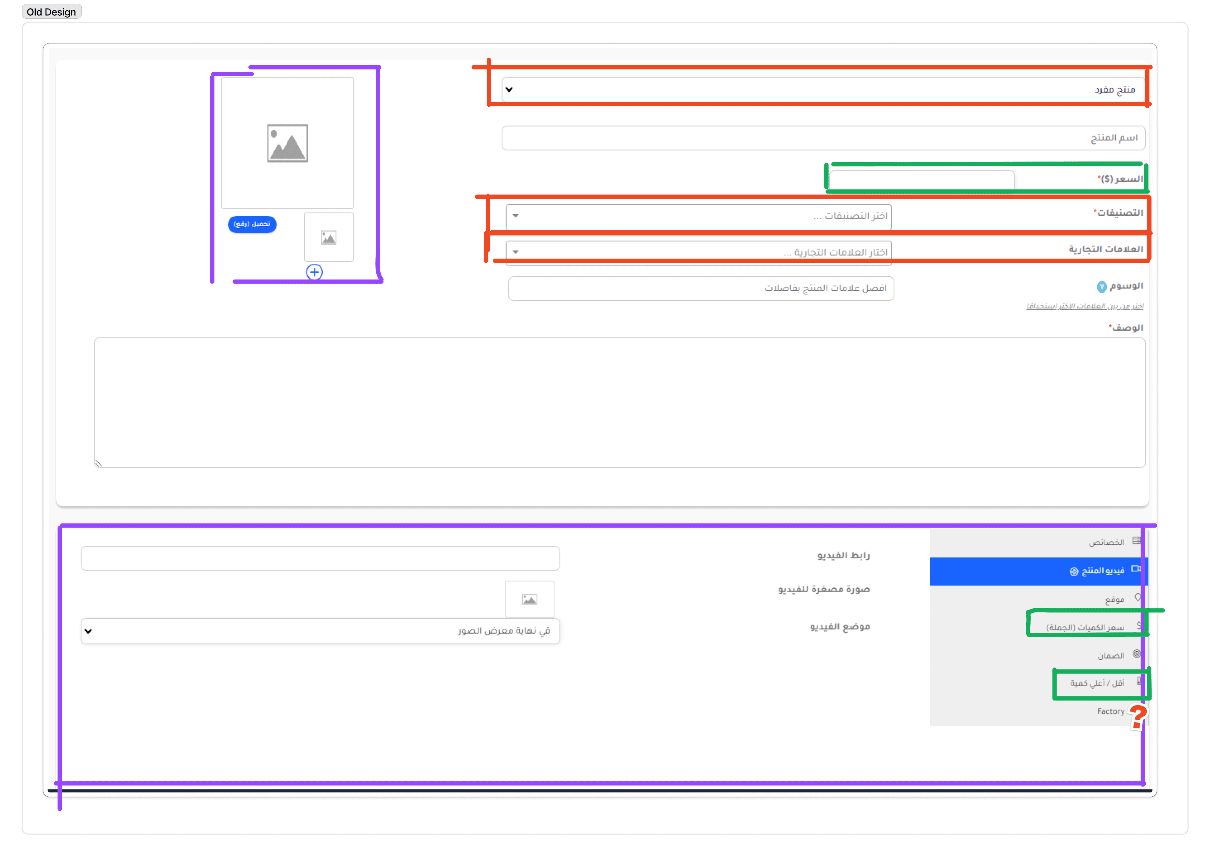
Dashboard product entry (old design)
At first glance, I noticed that a lot of related information was spread out across the Add Product page, making it harder to navigate. To highlight this issue for stakeholders and managers, I quickly marked these inconsistencies and explained why this was a problem. Users think in patterns and expect information to be structured logically. For example, the video upload section was placed further down the page, while the photo upload was positioned at the top left. This misalignment created confusion and forced users to spend more time figuring out where to input their content.
Competitive analysis
The competitive analysis examines the dashboard design, structure, and usability of key platforms, including Amazon, AliExpress, ePay, and Tjarahub. By evaluating how each platform organizes seller tools, presents analytics, and ensures ease of navigation, this analysis highlights best practices and areas for improvement. The goal is to understand how leading platforms optimize the seller experience, providing insights into what makes a dashboard both functional and visually appealing while maintaining efficiency and user confidence.


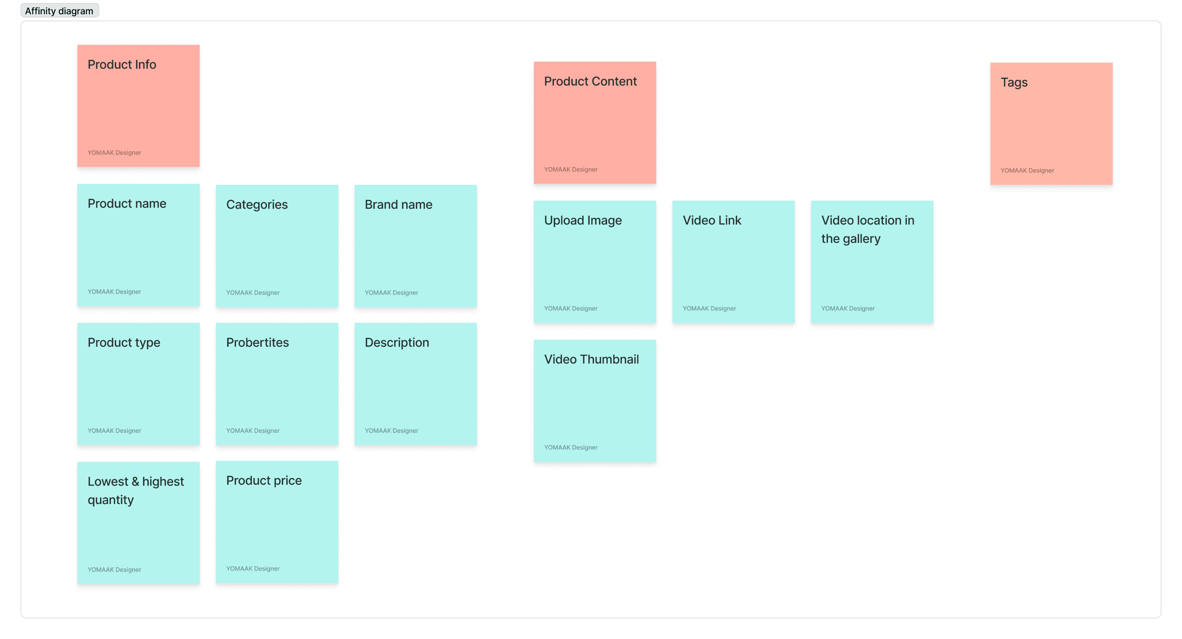
Affinity mapping
For the Affinity Mapping process, I focused on the "Add Product" page within the dashboard. I distributed its various elements—such as product categories, pricing, images, descriptions, and inventory settings—to our interview participants and asked them to help organize the information based on their intuition. This exercise provided valuable insights into how users expect the product listing process to be structured. By analyzing their input, we identified key patterns, grouped related fields together, and refined the layout to create a more intuitive and efficient Add Product experience. This step ensures that sellers can list products quickly and accurately, minimizing confusion and frustration.
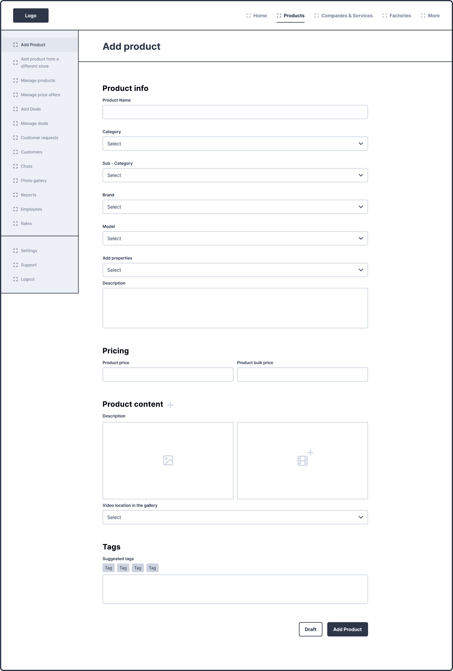
Wireframes
Addressing the Solution to the Filtering Problem
After conducting a competitive analysis, I designed an improved filtering system to enhance user experience and streamline product discovery.
Now, after entering the product name, users first select a category. Instead of endlessly scrolling through options, they can use a search filter to directly type keywords like "electronics," "books," or "clothes." Once a category is chosen, a subcategory is unlocked—also equipped with a search filter—allowing users to refine their selection even further. This system significantly improves product input and makes the process seamless.
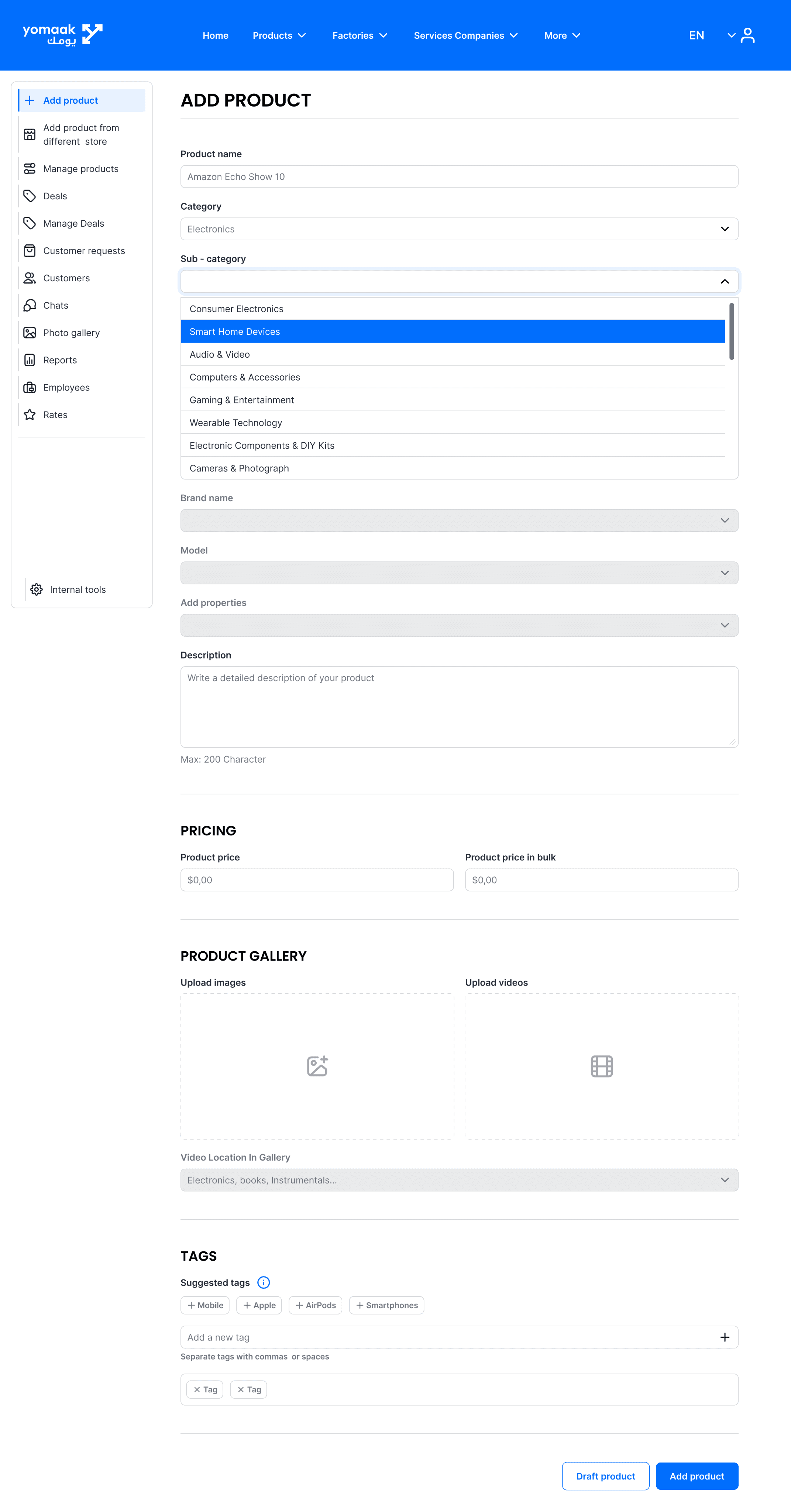
High fidelity design
After validating our solutions through wireframes and user testing, we translated them into a polished high-fidelity design that aligns with Yomaak’s brand identity.
🔹 Clean & Intuitive Layout – The dashboard now has a well-structured interface, ensuring users can navigate effortlessly.
🔹 Guided After-Subscription Flow – A step-by-step onboarding process helps new subscribers understand what to do next.
🔹 Improved Filtering System – Smart category filters make searching for products or services faster and more efficient.
🔹 Visual Hierarchy & Accessibility – Key actions and data points are more prominent, reducing cognitive load.
🔹 Consistent UI Components – Buttons, input fields, and icons follow a cohesive design system for a more professional look and feel.
With these refinements, the dashboard is now user-friendly, visually appealing, and optimized for efficiency, making it easier for businesses to manage their offerings on Yomaak. 🚀
Results & Takeaways
✅ User Complaints Dropped by 86% – The major usability issues were addressed, making the dashboard significantly easier to navigate.
✅ Improved After-Subscription Flow – Users now have a clear next step after subscribing, reducing confusion.
✅ Smarter Filtering System – Users can now easily find relevant categories and brands, making product listing more intuitive.
✅ Enhanced Data Structure – Key inputs like images, videos, and pricing are now logically grouped, improving user experience.
✅ More Efficient Workflow for Subscribers – he new design reduced the time needed to post a product or service.
Key Takeaways:
📌 Listening to Users is Key– Direct feedback from real users helped us identify pain points we wouldn’t have noticed otherwise.
📌 A Well-Structured UI Makes All the Difference – A clean, logical layout improves efficiency and reduces frustration.
📌 Collaboration Between Teams is Crucial – Working closely with development and marketing teams ensured that the redesign was not only user-friendly but also easy to implement.
📌 Testing Before Launch Prevents Future Issues – Clickable prototypes and user testing helped refine the experience before development, saving time and effort.